Silk Road Foundation
Refreshed the visual identity of a New York nonprofit, preserving its connection to Central Asian culture while making communication warmer, more open and easier to recognize.
- Period
- 2024
- Market
- New York, USA
- Scope
- Branding, illustration and web development
The foundation and its mission
Silk Road Foundation builds community and supports people from Central Asia living in New York. The visual system needed to communicate care, openness and practical support far from home.
It also needed to engage people willing to contribute through donations, volunteering, professional skills or personal support.
Cultural references without a museum tone
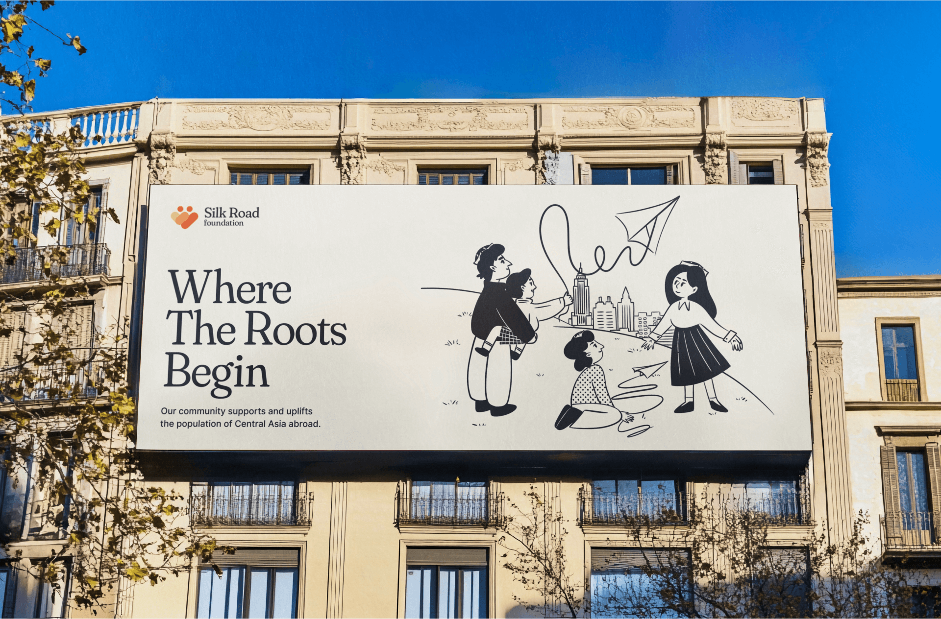
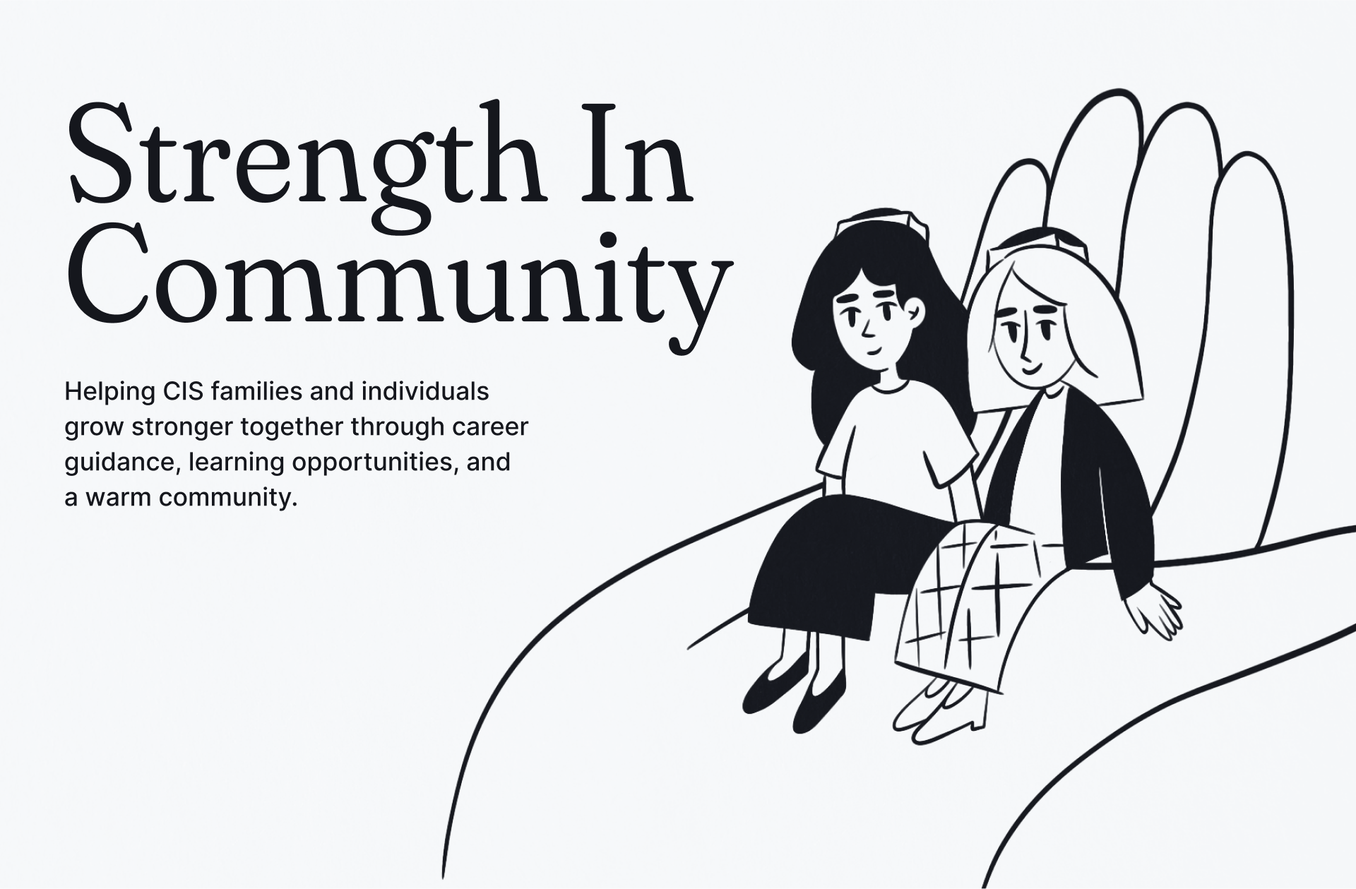
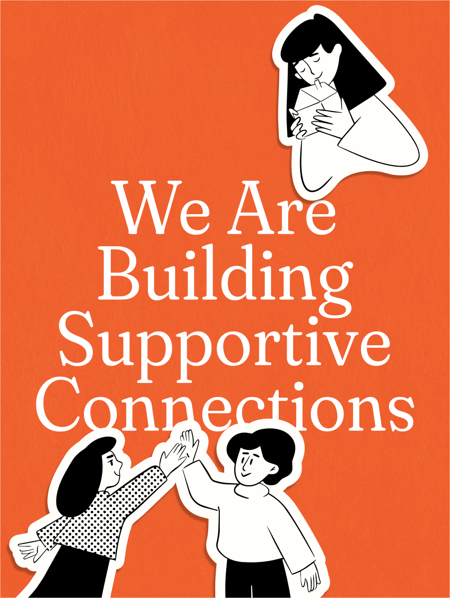
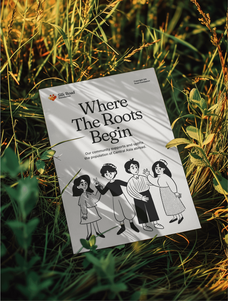
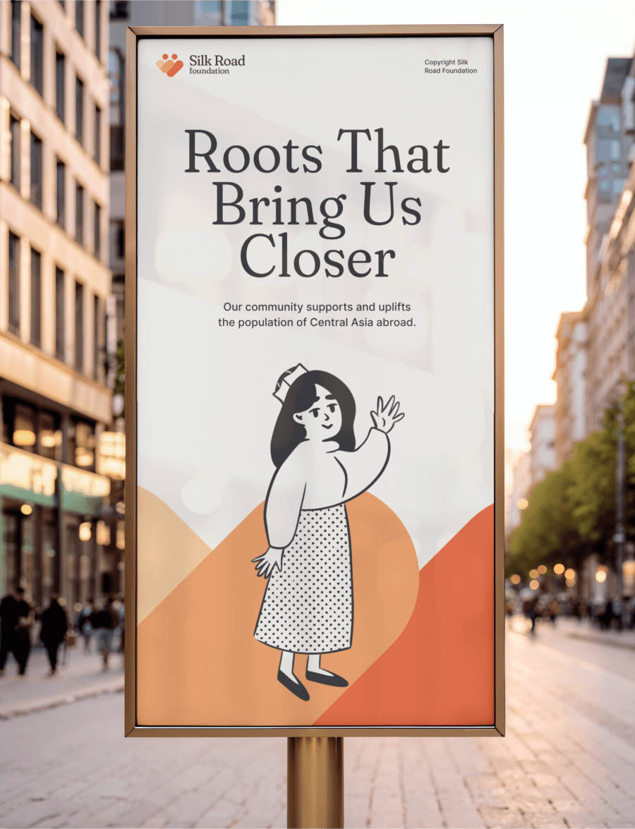
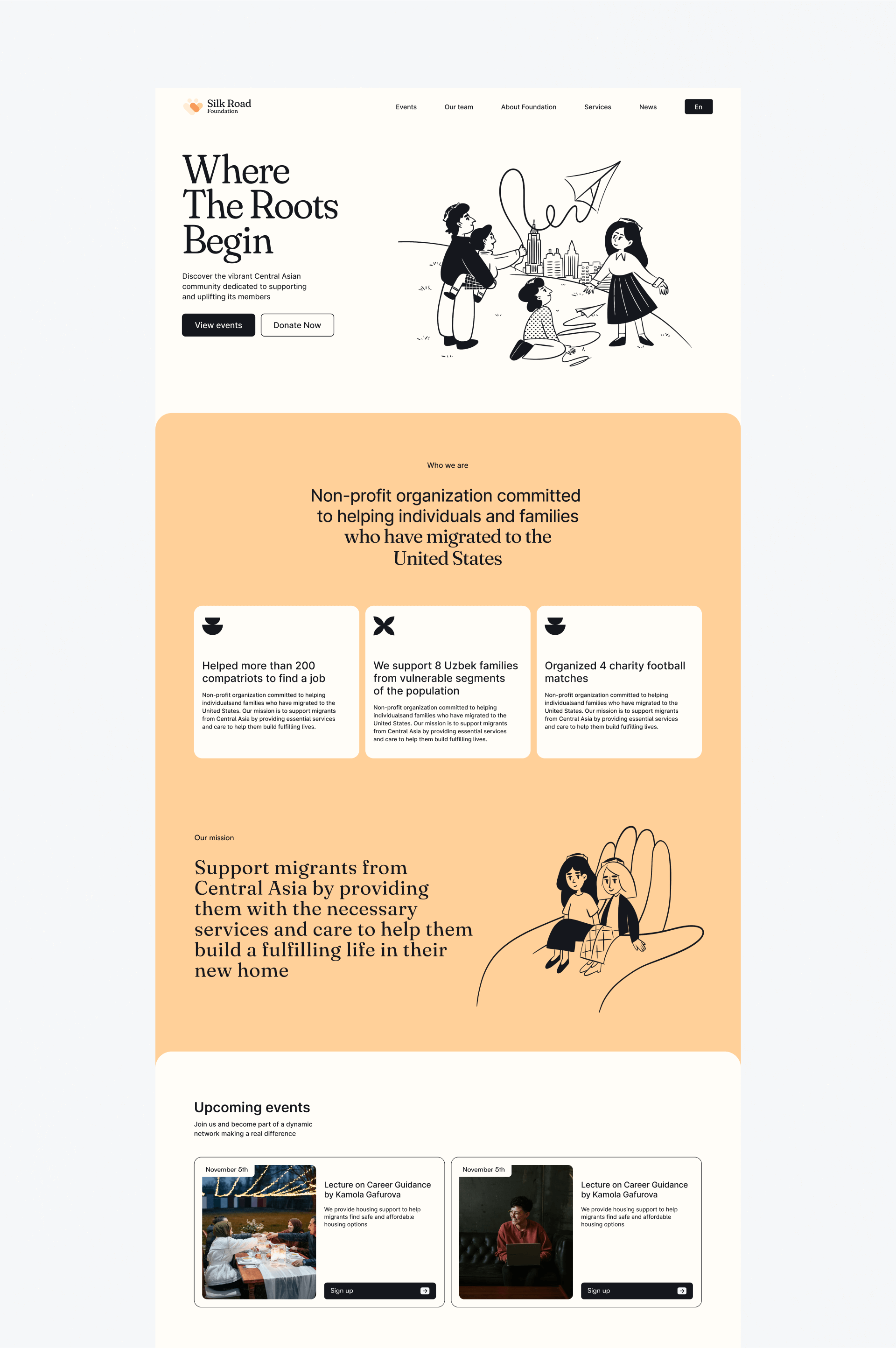
The system uses friendly line illustration, color and graphic motifs drawn from Central Asian visual culture. The scenes focus on family, friendship, care and shared celebration.
Traditional caps, a kite, clothing and patterns appear in the details. They are not added as decoration alone; they help people recognize lived experience and feel connected to the community.

Logo and message
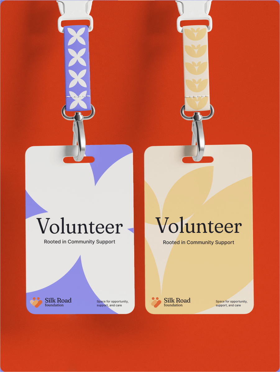
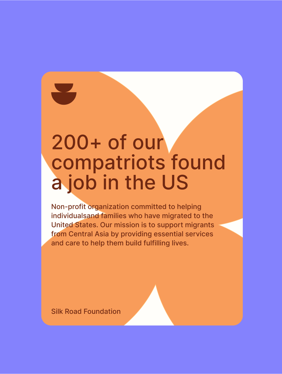
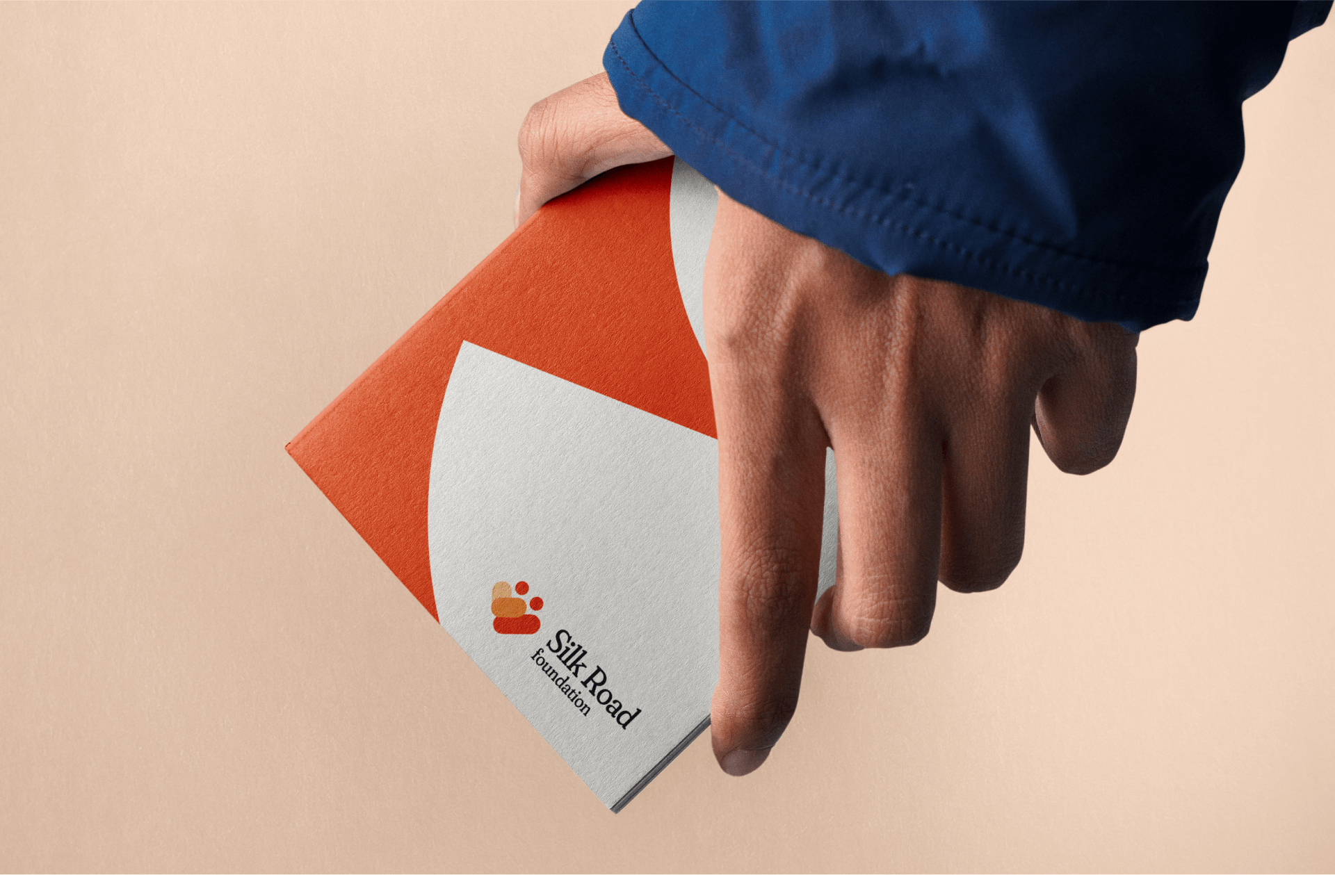
The new mark retains continuity with the previous version. Human silhouettes come together within its shape to form a large heart.
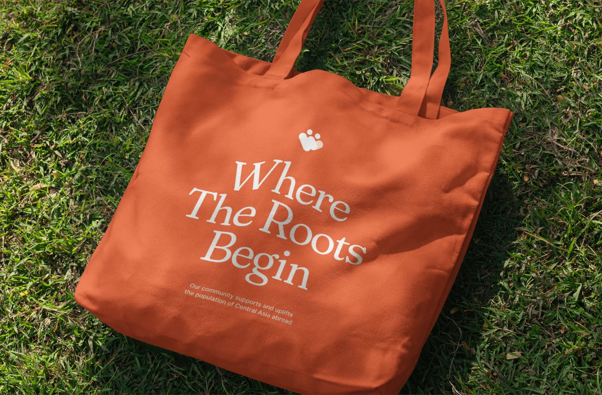
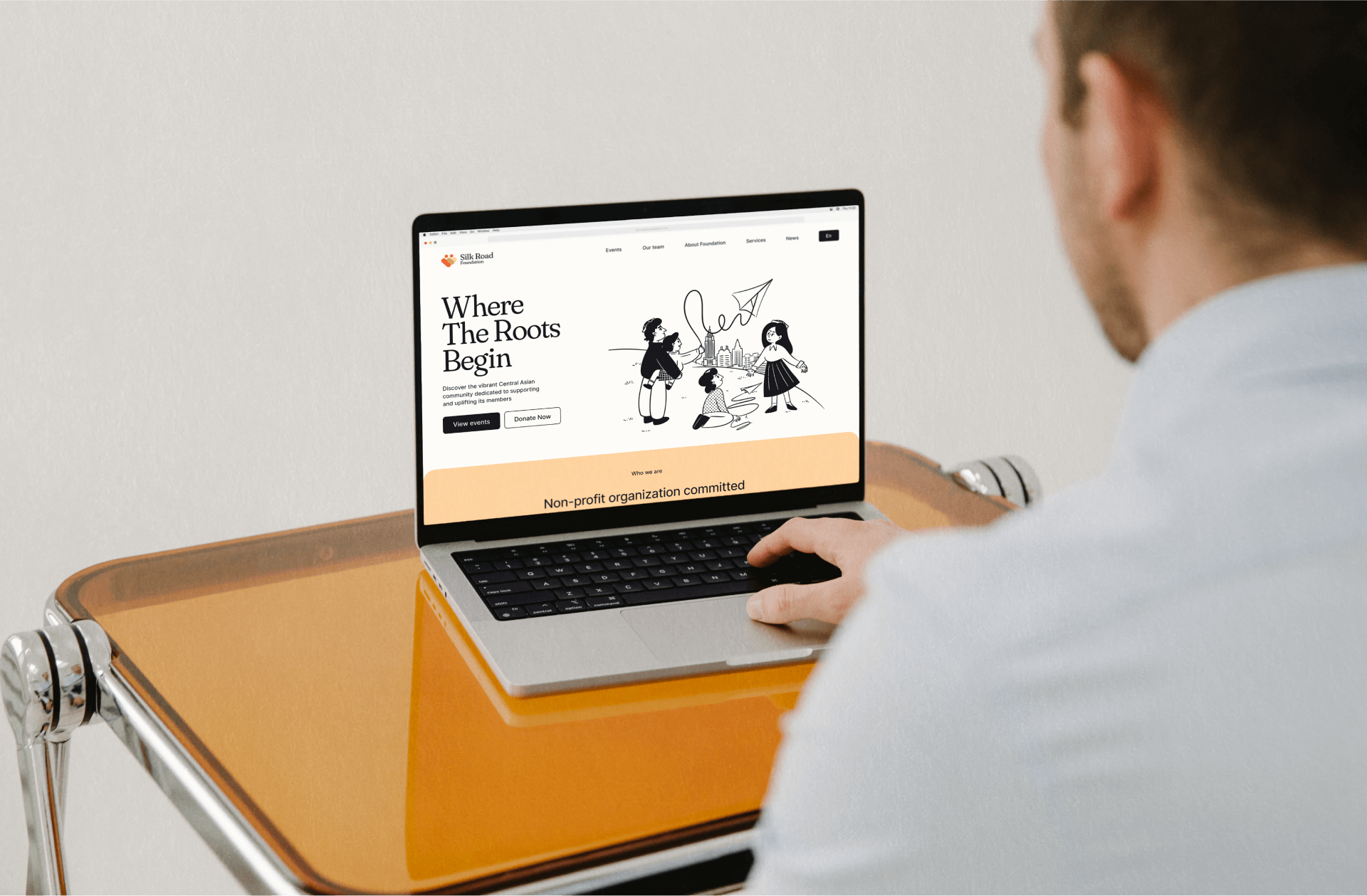
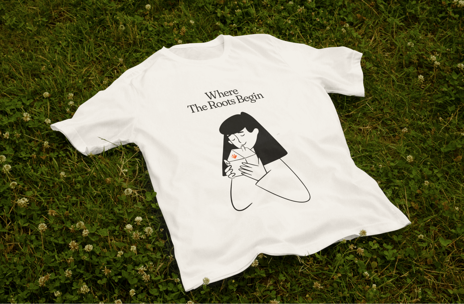
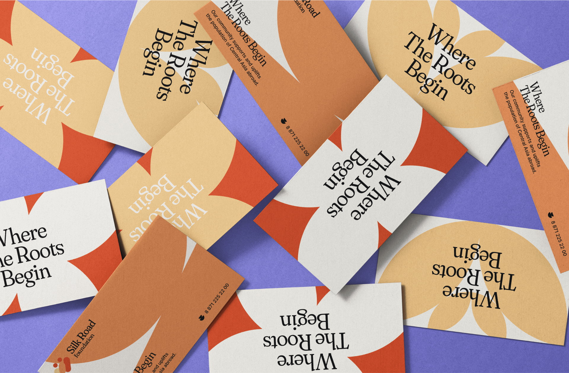
The message “Where the Roots Begin” emphasizes cultural heritage and connection to one’s roots. The foundation is presented as a second home where people can find support and understanding in the United States.
The system in use
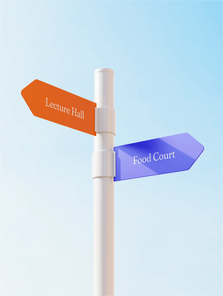
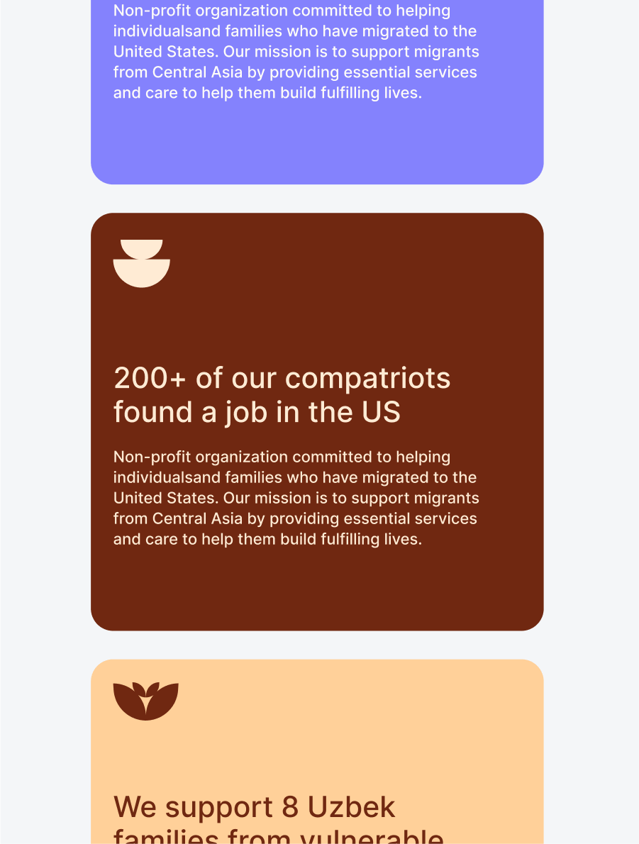
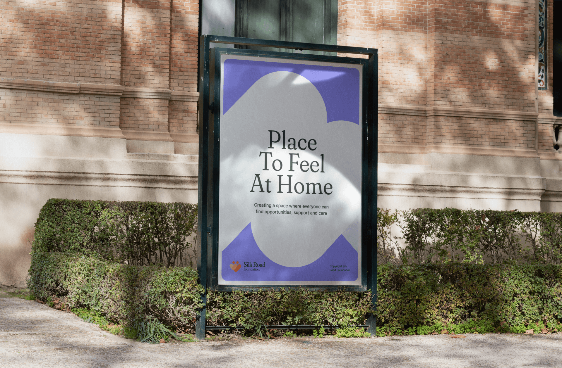
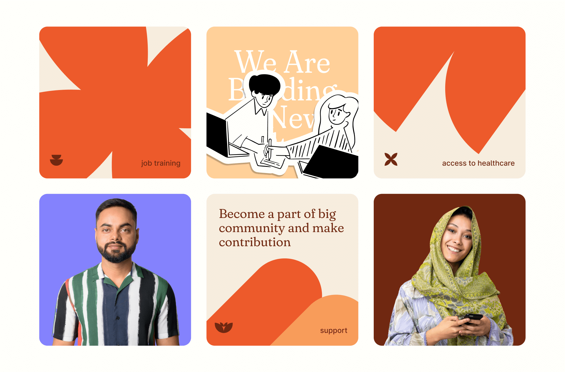
The identity scales from the website and social media to print and event materials. Illustration makes it possible to explain different forms of support while maintaining one emotional tone.
Result
The refreshed system brought the foundation closer to its community. Its visual presence became distinct, warm and recognizable while respecting the culture at its roots.
This case documents the qualitative outcome of the identity update; the foundation did not publish quantitative performance metrics.